A Unique Design for Quilicot Laval, Flagship Store, by Richporter Lighting
February 21, 2023
When it comes to retail design, first impressions are everything. You want customers to come in and see a store that is clean, inviting, and most importantly – different from the competition.
This is why Quilicot made sure to invest heavily in the design of its new flagship store in Laval. Richporter Lighting had an amazing experience working alongside DKA Architects and the owners of the store. The result is a truly unique space that is unlike anything you would expect from a bike retailer.
Distancing Itself from the Norm
Quilicot’s new flagship store has set itself apart from the traditional and conservative look of ‘regular’ bike shops. They have put a great focus on interior design and lighting to create a truly unique high-end retail experience.
The subtle minimalist boutique design has been combined with carefully selected materials and custom pieces that tell a story about the brand.
The Main Feature of the Architectural Design
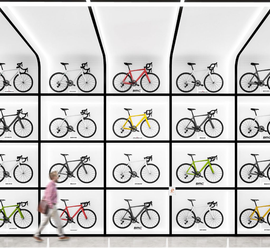
DKA Architects created an eye-catching design, with a dramatic entranceway setting the tone as soon as customers walk in. Experience traveling down the dark tunnel as you are drawn towards the main feature of the store – The Bike Wall.
Designed to create an attention-grabbing statement, the bikes are displayed in floor-to-ceiling grid shelving. Each section was illuminated to emphasize the bike which inhabits the space and creates a contrast to the black walls and ceiling.
Custom Grid System
The client wanted to create a truly one-of-a-kind look that would appeal to a vast array of customers. Their vision included a singular main light source covering the entire sales area.
The client wanted to create a truly one-of-a-kind look that would appeal to a vast array of customers. Their vision included a singular main light source covering the entire sales area.
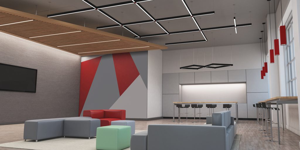
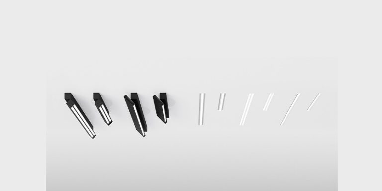
Our lighting designer at Richporter Lighting developed a truly unique, custom grid system using
Lumenwerx Squero Hubs linear lights. This light system is over 860 linear feet and although is used as general lighting, it is also a decorative element. This creative solution was intended to replicate the boxed bike wall grid while inverting the play on light and shadow.
Subtle Light Fixtures to Complete the Look
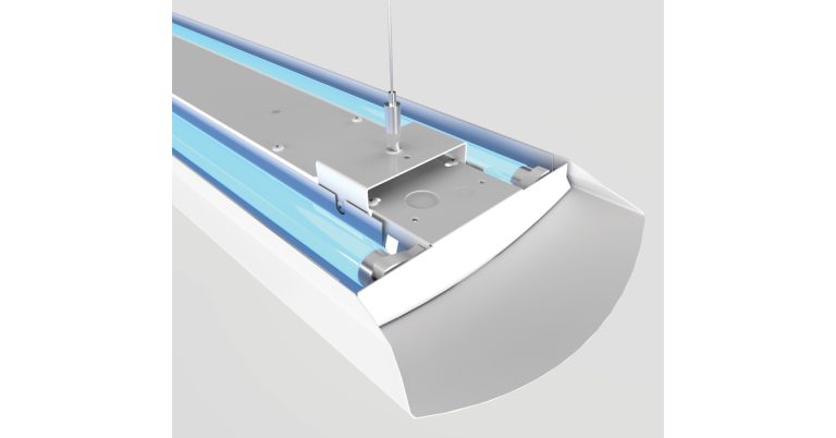
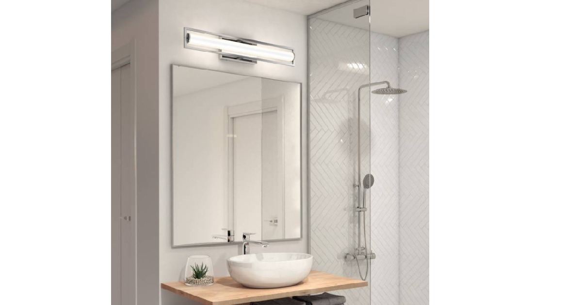
To efficiently cast light upon the counter space areas, we opted for a pendant tube linear light fixture called Revo by Lumenwerx. The size and shape of this fixture are reminiscent of a bike frame and provide well-shielded illumination to task surfaces.
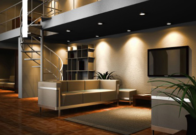
The remainder of the light fixtures placed around the floor was almost invisible to the eye. See how these cluster downlights by Lumenwerx disappear in the black ceiling?
This perfectly brought the client’s vision to life and created a space that was truly a one-of-a-kind design.
Quilicot’s New Visual Identity
Quilicot Laval’s new flagship store is a prime example of the importance of replicable design and visual identity in retail. There is much value in creating an environment that reflects the organization’s core values and brand message. Quilicot has set new standards for a cohesive approach by weaving its visual identity into every aspect of its retail experience.
By investing in a truly unique store design, Quilicot has successfully differentiated itself from the competition. They have successfully unveiled a new visual identity that is sure to turn heads and create a truly positive customer experience.
Are you ready to stand out from the competition with a uniquely designed space that reflects your brand? Contact us today to learn more about how we can apply our branded-oriented method to your business space.
Architecture: DKA Architects
Photography: DKA Architects & Richporter Lighting
First Published Here (Link)

