Bishop’s University Library Learning Commons: New Lighting and Interior Design
April 19, 2019
Founded in 1958, Bishop’s University Library (formerly the John Bassett Memorial Library) in Sherbrooke, Quebec serves the 3,500 students of Bishop’s University and Champlain Regional College. Thanks to a redesign by the architectural firm Lemay, with new lighting designed in collaboration with LumiGroup, the library is now a comfortable, well-lit work environment.
Bishop’s University Library has three levels: the basement, ground floor and second floor. All were in dire need of a refresh. Over the years, the library’s stacks had become so densely packed that they blocked most of the available natural light, despite the ample size of the building’s windows. Because it had many corridors, the library had become a dusty and confusing labyrinth. The low-ceilinged basement received no natural light at all, adding up to a far from inviting atmosphere.
Lemay and LumiGroup faced a major challenge: the partners had to refresh the library’s identity and turn it into a multifunctional space ideal for study, reading, discussions, meetings and public lectures.
Making way for natural light
“The library is part of Bishop’s University, which is a highly organized and structured academic institution, similar to its larger English-language peers. It is also surrounded by a beautiful forest of lush vegetation and large trees. From the outset, one of our goals was to bring that natural beauty inside the building,” says Eric Pelletier, architect and associate at Lemay. The team decided to prioritize natural light in the daytime and install effective artificial lighting in the building’s various zones.
In the first phase, the architects did significant work opening up and reorganizing the space, to make it easier for students to move from floor to floor. With book loans in decline, due to growing Internet use, the stacks were also thinned out in order to de-clutter the space. The result: from morning to afternoon, the ground floor and upstairs are bathed in natural light, where previously there was barely any at all.
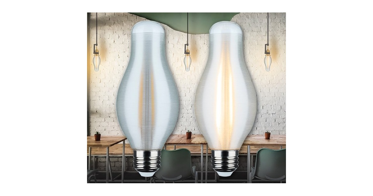
Upon entering the library, the large windows and vertical lighting inspire a sense of clarity and serenity. “The L191 pendant lamps by MP Lighting reflect the library’s unique identity. The entrance zone is also the only place where we installed those particular lights,” Eric Pelletier says.
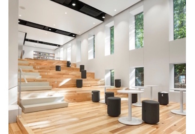
The Agora is the hub, finished in wood, where the ground floor and second floor meet. All parts of it, including each step of the staircase, are flooded with natural light. “The Agora is the heart of the building. It’s a traffic area, but also a space for reading and for listening to guest lecturers. So we needed to provide uniform lighting, as in the rest of the building, but in this case, it had to be adaptable to different kinds of events,” Eric Pelletier explains. Attractive black Max Cylinder fixtures by Lightheaded Lighting, echoing the stools arranged around the tables, were installed in the ceiling inside black baffles that help dampen sound. They are almost invisible, melting perfectly into their surroundings. Dimmers make it possible to adjust the lighting for lectures.
Lastly, to make the most of the available natural light, several study rooms with large windows were added to the second floor. At any time of day, students working in these rooms enjoy bright lighting while feeling a sense of immersion in the surrounding landscape.
Creating sub-spaces for lighting each zone
As well as bridging the inside and outside, the designers wanted to create multifunctional zones while keeping traffic moving smoothly. Today’s libraries are versatile spaces, where people can study and read, and also gather, work on group projects, have discussions and attend training sessions. “We built a large wooden spine on each floor. It snakes through the entire building, connecting each functional zone,” the architect says. Whether their destination is a study room, large or small meeting room, desk or reading corner, students can easily find their way.
To separate the zones and give each one a distinctive ambience, LumiGroup specified directional and spotlighting. In the basement, worktables are equipped with low desk lights in the form of L161 linear LED lamps by MP Lighting. The lights are attached to the tables along with their entire length, allowing students to study comfortably for hours on end.
In the stacks, L106 surface-mounted linear fixtures by MP Lighting are installed around the entire perimeter of the building to provide fresh illumination for the once-dim basement. “The basement was a problem, because, not only was there zero natural light or sunshine, its ceiling is very low. That makes the space feel dark and cramped. With the new wall-mounted lighting all around the library, it no longer feels like a basement,” Pelletier adds.
Lastly, Ondaria ceiling fixtures by Zumtobel illuminate the two reading areas at either end of the building, giving the spaces a warm and relaxing atmosphere. “We wanted to echo the ’60s-vintage lighting fixtures that had been installed in earlier eras. As it happens, the new ones are a near-perfect match for the old fixtures,” he says.
In sum, this collaboration between Lemay and LumiGroup demonstrates how a close alignment between architectural and lighting concepts can contribute to a project’s success. High-quality lighting is always desirable, but it is crucial to a library because it gives users optimal reading and study conditions. By prioritizing natural light and working with several different fixtures and lamps, the partners successfully transformed the Bishop’s University Library into a versatile, warm and enjoyable space — an accurate reflection of the university.
Project summary
- Project name: Bibliothèque Learning Commons de l’Université Bishop’s
- Architecture: Lemay
- Partner — Design director: Eric Pelletier
- Project manager: Annie Martineau, architect
- Lighting Design collaborator: LumiGroup
- Featured Lighting Manufacturers: Pinnacle, Zumtobel, Lightheaded, MP Lighting, Luminis, Paco
{loadposition slideShow37}
Photo credit: Stéphane Groleau


